Color and environment matching is the top priority in logo design. It is harmonious and beautiful, and the style is determined. When we choose the color of the logo, we can make the artistic sense by positioning the project, or the color is close to unity, or the color is gorgeous. Next, we will tell you how to design according to the principle of choosing the color of the logo.
基本色組:12色輪
Basic color group: 12 color wheel
色輪,可配色方案的設計,我們可以創建了一個色輪,12個顏色的色調的色輪經久不衰,也是經典之作。圍繞顯示的顏色之間的關系,我們由此展開創造標識牌設計的特性,不同的建筑使用不同的標識牌顏色。
Color wheel, color scheme design, we can create a color wheel, 12 colors of the color wheel lasting, is also a classic. Around the relationship between the displayed colors, we start to create the characteristics of signboard design. Different buildings use different signboard colors.
使用色輪,您可以輕松找到環境與標識牌之間的顏色組合,看看有什么效果比較好。
With the color wheel, you can easily find the color combination between the environment and the signboard to see what effect is better.
01 及小區針對的色調
01 colors for shopping malls and communities
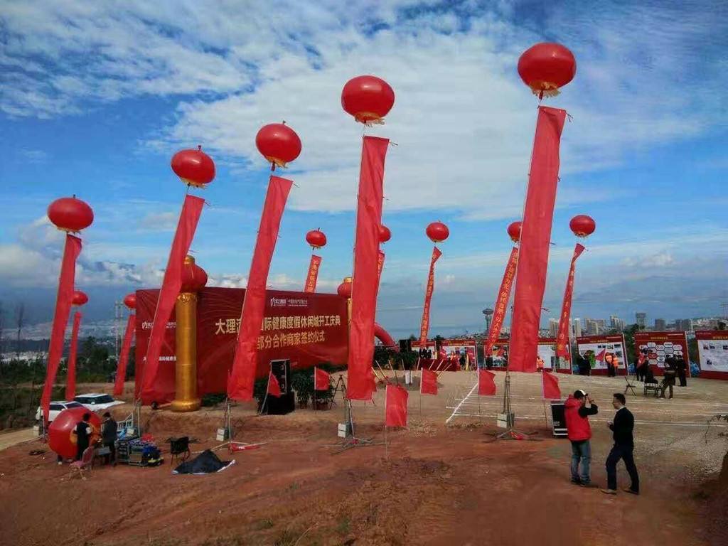
咖啡色、金色、橘色,這些顏色與所定位的主題思想有關,但通常要明亮有光,色彩斑斕,規格高大上為,看一些高端的別墅群和公寓,他們在選擇標識牌顏色時肯定不會青青藍藍,綠綠紅紅,富貴的象征從來不是花哨的。
Coffee color, gold color and orange color are related to the theme of shopping malls, but usually the shopping malls should be bright and bright, colorful, and the specification and height should be the focus. Look at some high-end villas and high-end apartments. When they choose the color of signboards, they will definitely not be blue and blue, green and red, and the symbol of wealth is never fancy.

02 學校及醫院針對的色調
02 colors for schools and hospitals
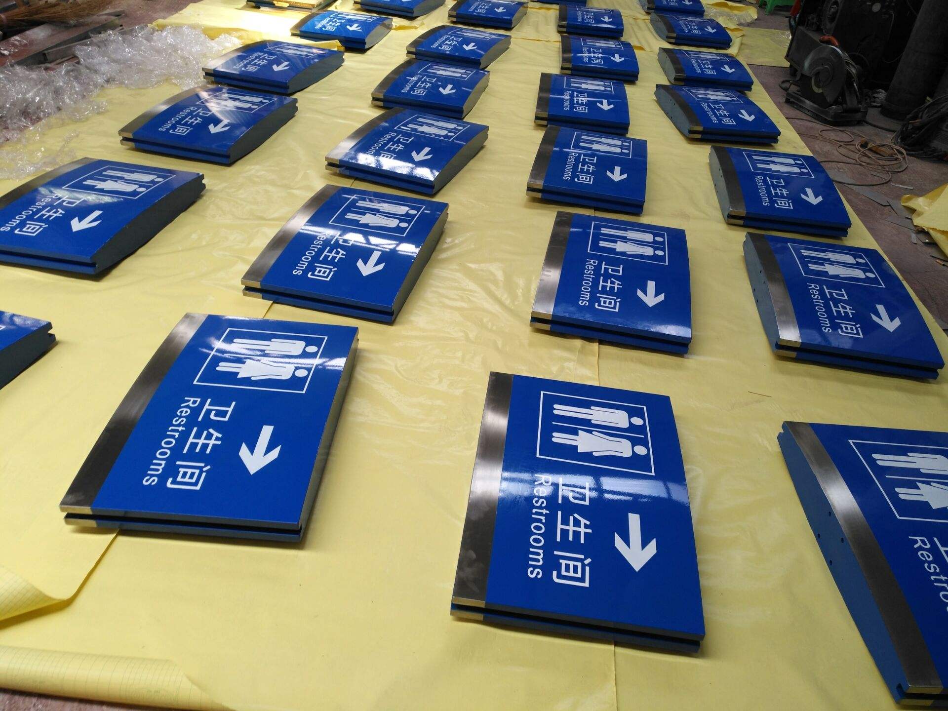
藍色、黃色、白色、綠色;學校是充滿勃勃生機的希望之地,未來祖國的搖籃,綠色是不可缺少的顏色,探索未知的世界,不但從課本上探求,我們身邊的環境也可以讓同學們產生無限的大自然聯想,綠色代表青山,而藍色就帶邊之高的天空和無邊的海洋,藍色標識牌自信和積極,擁有寬厚的包容之心和善良的溫和之心。
Blue, yellow, white and green: the school is first of all a place of hope full of vitality, the cradle of the future motherland, green is an indispensable color, exploring the unknown world, not only from textbooks, but also from the environment around us, students can have unlimited natural association, green represents green mountains, while blue is the sky with high edge and boundless ocean, blue Color signs are confident and positive, with a generous and tolerant heart and a kind and gentle heart.
03 酒店及工作室針對的色調
03 colors for hotels and Studios
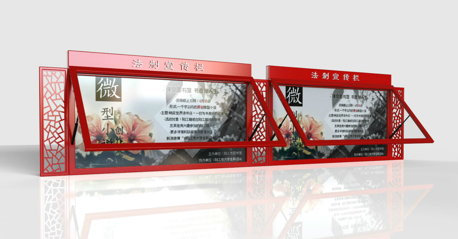
黑色和紫色標識牌在導視系統設計中,優雅,穩重幽默,風格獨特,黑色或紫色字體標識牌設計在白色底部上,更加層次分明,黑色和紫色能讓其他彩色文字工作凸顯不一樣的風采。
In the design of the guide system, the black and purple signs are noble, elegant, steady and humorous, with unique style. The black or purple type signs are designed on the white bottom, which is more hierarchical. Black and purple can make other color text work highlight different styles.
04 辦公室及寫字樓針對的色調
04 colors for offices and office buildings
銀色(金屬色)經常被用來作為文字的背景顏色。在使用金屬標牌的標識牌中,你能夠獲得一個很強烈的視覺沖擊感,金屬銀色拉絲很時尚,很有身份象征;在辦公室或寫字樓中的標識牌,標識牌用銀色背景黑字搭配,會拉近客戶的信任,充分顯示公司的實力。
Silver (metallic) is often used as the background color of text. In the use of metal signs, you can get a strong sense of visual impact. The silver metal wire drawing is very fashionable and has identity symbols. In the office or office building, the logo is matched with black characters on the silver background, which will bring the trust of customers closer and fully show the strength of the company.