

Color is very important in the production of advertising signboard, but because each favorite color is different, so according to the different production of outdoor advertising, different size, different application, the color requirements for the design are also different, how to design a good-looking work out. So here's how to design a better advertising signboard?
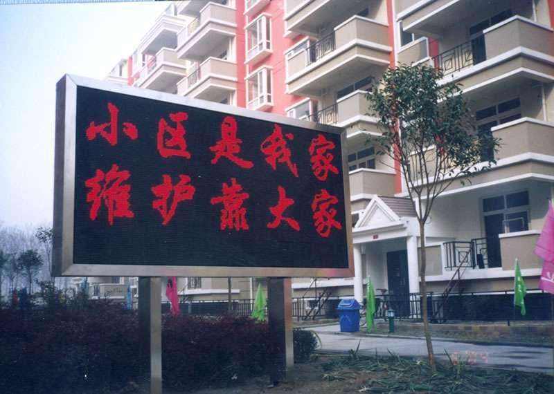
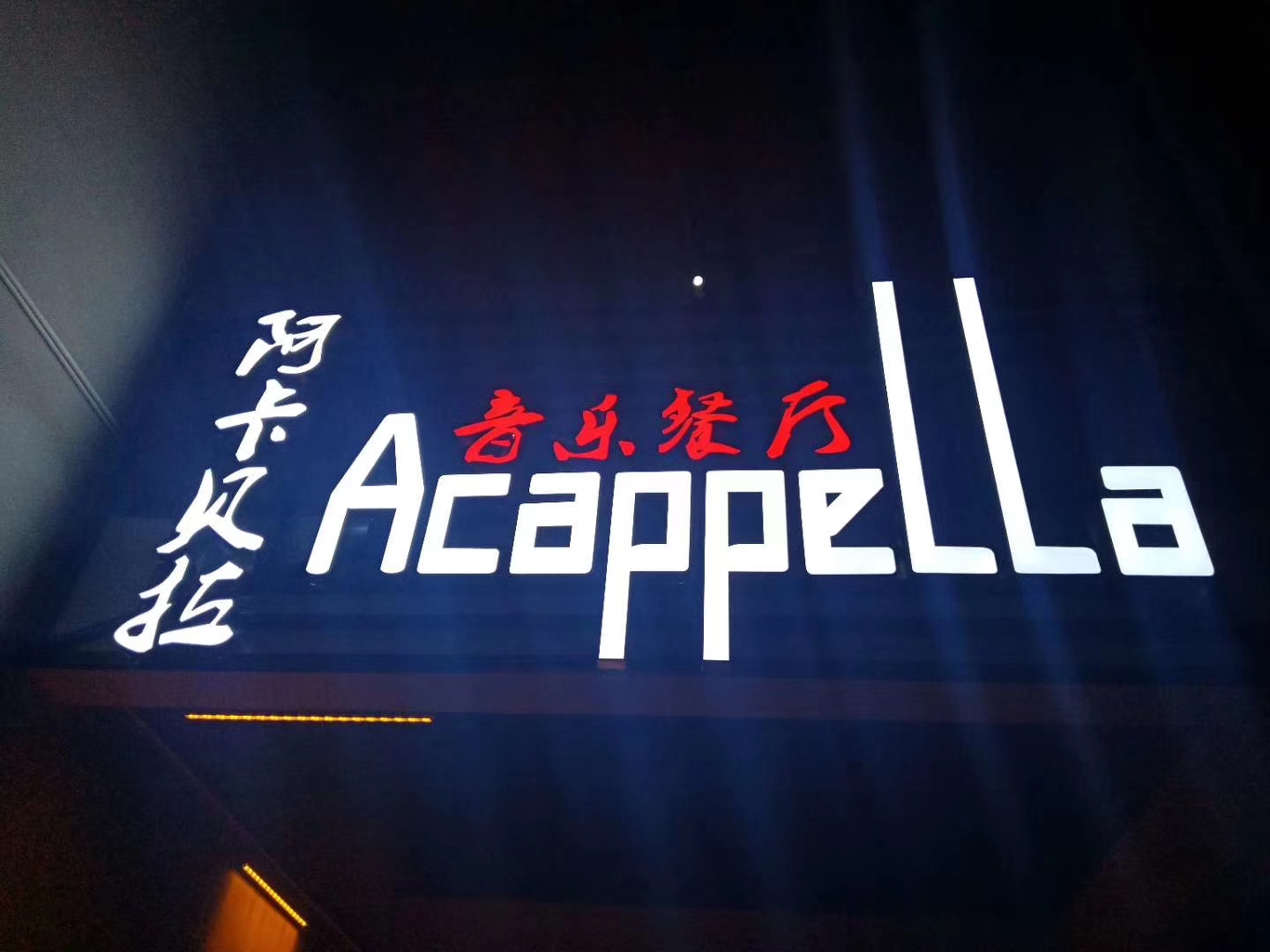
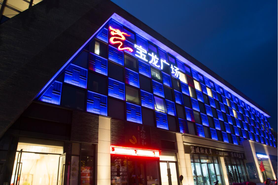
紅色:需要注意紅色的對(duì)比色為綠色,所以想顯眼的話以綠色為主色調(diào)比較好于用哪種綠色就必須是具體情況而定另外美觀之類的那就必須靠個(gè)人經(jīng)驗(yàn)和能力了。看周圍環(huán)境,配合好,形成個(gè)比較搶眼的色調(diào)。任何色彩都需搭配才有美的一面,大紅大綠是俗氣,萬(wàn)綠叢中一點(diǎn)紅那就是美麗。尋找可以對(duì)比的色調(diào),如色紅與綠、黃與紫、橙與藍(lán)。這些色彩的搭配難,但效果是比較顯眼且刺激的一種,注意只要中性色調(diào)和得當(dāng),對(duì)比色比例適當(dāng)就是出現(xiàn)令人驚奇的效果。多種顏色的應(yīng)用,這種色彩是高 貴、協(xié)調(diào)的的搭配,對(duì)比雖不強(qiáng)烈,但和諧,不過(guò)操作費(fèi)事,注意黑白灰三大關(guān)系。

Red: you need to pay attention to the contrast color of red is green, so if you want to be conspicuous, it's better to use green as the main color. As for which kind of green to use, it must depend on the specific situation. In addition, it must depend on personal experience and ability to be beautiful. Look at the surrounding environment, with good, form a more eye-catching tone. Any color needs to match to have a beautiful side, red and green is vulgar, a little red in the green cluster is beautiful. Look for contrasting hues, such as red and green, yellow and purple, orange and blue. These colors are difficult to match, but the effect is more conspicuous and exciting. Note that as long as the neutral tone and appropriate contrast color ratio is appropriate, it will have a surprising effect. The application of a variety of colors, this color is noble, harmonious collocation, although the contrast is not strong, but harmonious, but the operation is cumbersome, pay attention to the relationship between black, white and gray.
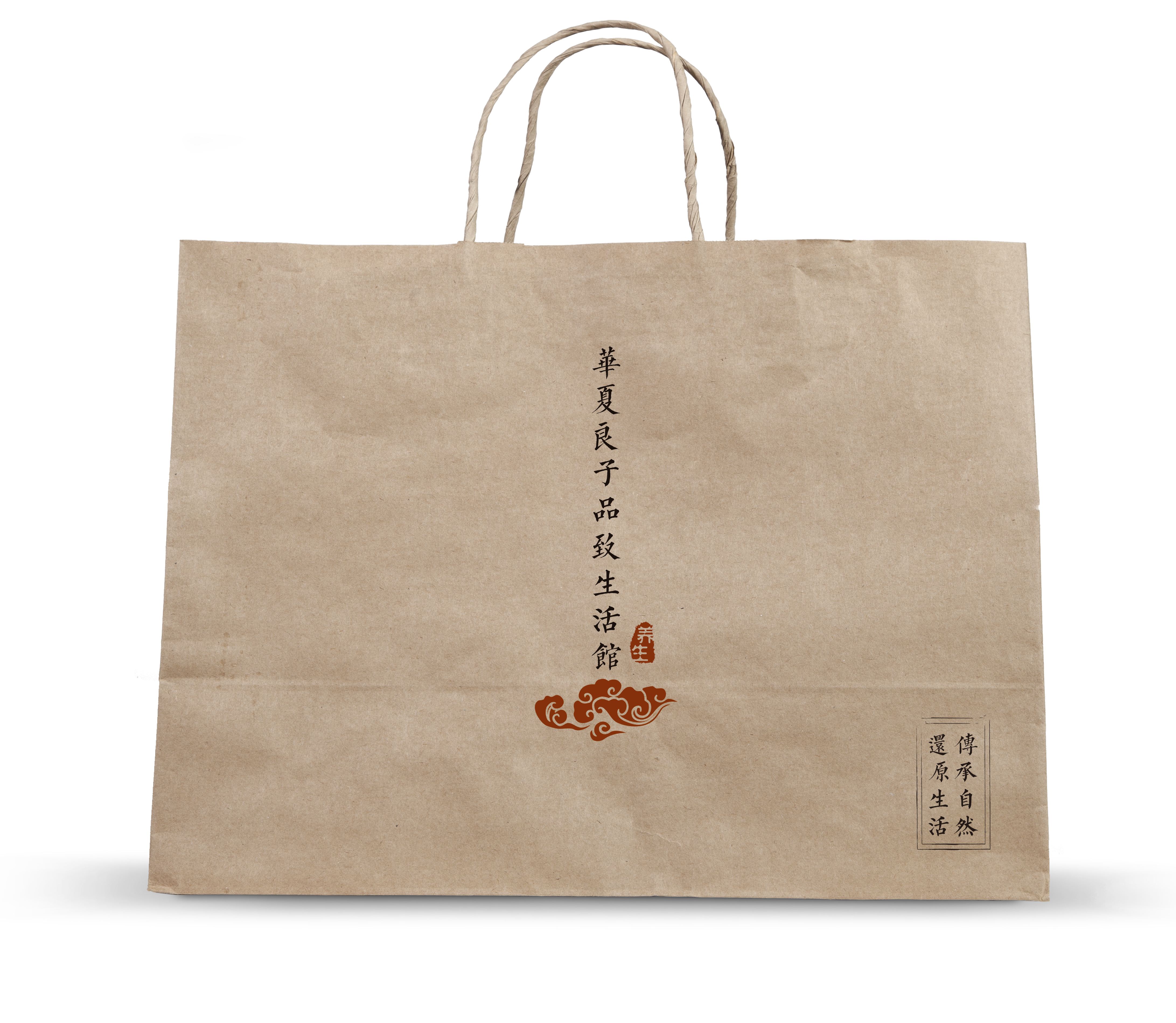
相同似的同類色調(diào),這是容易出效果的操作,只要把同類色搭配一起馬上就會(huì)出現(xiàn)協(xié)調(diào)效果,如深紅、大紅、粉色等搭配,就會(huì)出現(xiàn)暖色調(diào)有溫馨浪漫之意。大關(guān)系處理好,非常容易上手。創(chuàng)意的想法創(chuàng)意與色彩。不用擔(dān)心混合你的背景,或加上偶爾的輪廓,或下將的陰影。你必須小心不要使用太多的顏色,因?yàn)檫@會(huì)讓人難以閱讀。視覺(jué)混亂是常見(jiàn)的錯(cuò)誤。嘗試運(yùn)用色彩,吸引目標(biāo)觀眾。
The same kind of color, this is easy to effect the operation, as long as the same kind of color together, will immediately appear coordination effect, such as deep red, red, pink collocation, will appear warm color, warm romantic meaning. It's very easy to handle big relationships. Creative ideas, creativity and color. Don't worry about mixing your background, or adding occasional silhouettes, or shadows that will fall. You have to be careful not to use too many colors because it's hard to read. Visual confusion is a common mistake. Try to use color to attract the target audience.
感謝您的閱讀,希望以上內(nèi)容對(duì)您有所幫助,如想了解更多精彩內(nèi)容請(qǐng)點(diǎn)擊:濟(jì)南廣告制作公司https://www.m.tb10.cn 。
Thank you for reading, hope the above content is helpful to you, if you want to know more wonderful content, please click: Jinan advertising production company https://www.m.tb10.cn .

系電話")
郵箱")

